Page loading


L’homme au coin

10 pages,
format 8,5 x 8,5 cm.
tirage à environ 30 exemplaires en typographie au plomb.
Thomas Braun
des fromages

8 pages,
format 11,2 x 9 cm.
tirage à 131 exemplaires en typographie.
CLS

Un volumen,
79 cm de long, 17,5 cm de haut.
tirage à 10 exemplaires en linogravure.
Marie-Rose de France

26 petits textes en proses poétique. Vignettes de CLS.
tirage à 120 exemplaires en typographie au plomb.

Flyer
Marie-Rose de France
|
|
36 p., format 10 x 14 cm. composé et imprimé en typographie au plomb Tirage à 120 exemplaires. (cliquer sur l'image pour en savoir plus) |

-

 Authors
-
Chronological
- • 1977 (1-12)
- • 1978 (13-23)
- • 1979 (24-27)
- • 1980 (28-39)
- • 1981 (40-52)
- • 1982 (53-64)
- • 1983 (65-74)
- • 1984 (75-97)
- • 1985 (98-114)
- • 1986 (115-120)
- • 1987 (121-127)
- • 1988 (128-134)
- • 1989 (-)
- • 1990 (135)
- • 1991 (136-138)
- • 1992 (139-144)
- • 1993 (145-153)
- • 1994 (154-163)
- • 1995 (164-172)
- • 1996 (173-188)
- • 1997 (189-194)
- • 1998 (195-196)
- • 1999 (197-201)
- • 2000 (202-206)
- • 2001 (207-213)
- • 2002 (214-220)
- • 2003 (221-224)
- • 2004 (225-226)
- • 2005 (227-229)
- • 2006 (230-231)
- • 2007 (232-237)
- • 2008 (238)
- • 2009 (239-247)
- • 2010 (248)
- • 2011 (249-251)
- • 2012 (252-255)
- • 2013 (256)
- • 2014 (257)
- • 2015 (-)
- • 2016 (258-260)
- • 2017 (261-263)
- • 2018 (264-269)
- • 2019 (270-273)
- • 2019 (274-276)
- • 2021 (277)
- • 2022 (278-281)
- • 2023 (282-284)
- • 2024 (285-285b)
- • 2025 (286-288)
- • 2026 (289)
-
Des barbares...
... for those who are too lazy to seek.
-
Biblioteratology
- • 01. Chez les brocheurs [1]
- • 02. Chez les éditeurs[1]
- • 03. Chez les relieurs [1]
- • 04. Chez les relieurs [2]
- • 05. Chez les éditeurs [2]
- • 06. At the readers [1]
- • 07. Chez les éditeurs [3]
- • 08. Chez les éditeurs [4]
- • 09. Chez les éditeurs [5]
- • 10. Chez les relieurs [3]
- • 11. At the bookstores [1]
- • 12. Among layout designers [1]
-
Entertainments
-
Fin-de-Siècle
-
Fourneau and Fornax
-
Printings
-
Typography
14622468 visitors
39 visitors online


“That's it! You've gone and wasted more money on something you don't need…”
“Er, what's it to you, you miserable little twerp?!”
“…None of my business, I know, and I absolutely love sticking my nose into things that don't concern me. I admit it! So you've bought yourself another book…”
“…for my technical library, yes. And your point is…? What's wrong with that? And I would appreciate it if you addressed me as ‘Sir’ from now on. A simple matter of respect, on your part.”
“Well, as I understand it, the book you've just bought is one you've already got… in photographs, I mean, photos you took yourself…”
“I see our little twerp is rather well informed. What he doesn't seem to understand, however, is the difference between reality and an image of reality. As Comrade Korzybski puts it—and he's not the only one—‘The map is not the territory.’ And a picture of a book is not the book itself. It has none of the book's weight, its feel, its smell… And there is far more pleasure in leafing through a real book than in scrolling through pictures on a screen, which, on top of everything else, may tire your eyes—or at the very least tire them a good deal more than reading a good book by the light of a good candle…”
“A good candle…”
“Yes, or, if you're a thoroughgoing modernist, by the light of a not-too-bright electric lamp. And, needless to say, while sitting comfortably in a nice, soft armchair.”
“Well, well! You certainly know how to tell us things…”
“Go on, mock me, mock me, you ignorant Philistine… always glued to one screen or another.”
“I imagine, Sir, that you are also partial to making notes on fresh clay tablets with a wedge-shaped reed.”
“Well now! Perhaps you're not quite the Philistine I took you for, since you seem to know something about the existence of cuneiform inscriptions…”
“Yeah, well, that's all very nice, but it still doesn't beat a cracking good manga downloaded from some dodgy Japanese website!”
“I shall leave you to answer for your own words… though I have my own thoughts on the matter. If you'll excuse me, I'll be off. I have more important things to do… like leafing through my new book, for instance…”
Chance—that suspicious entity which more often than not plays some thoroughly nasty tricks on us—was responsible for the arrival, just this very morning, of a book I had never dared hope to place on the shelf reserved for typography manuals in my technical library. It all began with an exchange of emails, sent using my pedal-powered computator, its brass gears painstakingly filed by hand, and connected to my hand-operated printing press by a bicycle chain. The emails were with a correspondent whose name I shall not reveal, in order to spare him any unwanted attention. We were discussing printers' correction marks. We talked about Castillon's manual (1783), Brun's manual (1825), and I mentioned Vinçard's L'Art du typographe (1806), a manual I rather like. The page devoted to printers' correction marks in Vinçard's book was not printed in good, honest, solid hot-metal type, as Brun's was, but by intaglio printing. This was despite the fact that intaglio is more expensive, more complicated, and less logical to use in a book devoted to typography. The reason is simple: it is much easier to produce the marks that way, and the result is closer to the handwritten signs used by proofreaders.
Once our email exchange had come to an end, it occurred to me to have a look at the online bookshops and antiquarian booksellers' websites to see what old typography manuals might be available. I have quite a number of them already, but there are still gaps on my shelves. Every now and then—though not very often—I check those websites, which I shall leave unnamed, to see whether one or another might have come up for sale. I do so without much hope, I must confess, because the ones missing from my shelves are precisely those that are rarest and hardest to find. Please don't take this confidence as an invitation to burgle my house: it is under electronic surveillance, and you might well get caught.
And then, there it was. A Vinçard for sale! No sooner said than done: I bankrupt myself! Well, admittedly, it wasn't the 1806 edition, but the second edition, published in 1823. Not as good. Not as complete. Revised, corrected, and expanded, yet somehow less complete than the 1806 edition. No samples of coloured inks, no examples of heavy papers coloured throughout the sheet for making covers. You know all this, of course, because you've read the wonderful book Jacques André and I wrote, Histoire de l'écriture typographique au XIXe siècle français (A History of French Typography in the Nineteenth Century). You haven't? Well, what on earth are you waiting for?
According to his own son's admission, the first edition is better than the second.
First edition: 6,000 copies, now out of print.
Second edition: print run of 1,500, of which only 1,200 were sold.
Set by Vinçard fils in a printing shop very poorly supplied with type (Hardy, rue Saint-Médéric).
Vinçard fils is one of Lacrampe's associates (see →here, in French)
His father was still alive in August 1839.
So does this second edition have nothing going for it? Of course it does! It has the merit of existing, and I have the merit of having bought it. Besides, my copy has a few rather amusing peculiarities of its own. Its binding is somewhat unremarkable and a little clumsy. There is nothing particularly noteworthy about it, unless you count the decorative border made with a roll tool—which, admittedly, isn't much to write home about either!
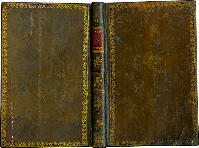
Flat binding.
The title label, however, has a particularly amusing feature, especially for a typography manual. It reads:
ART
DU
TIPOGRA
Of course, it isn't the missing PHE that makes me smile. It's the I in TIPO. One can only assume that the person who did the lettering was Italian and inadvertently followed the spelling of his mother tongue.
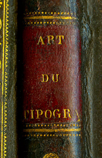
Title label.
More troublesome for me, as the new owner of this copy, is the absence of leaves 27–28, which some disrespectful two-legged creature has torn out. Fortunately, I can remedy this by copying the photographs I took of the corresponding pages in the copy held at Estienne. But this loss is compensated for—by a curious paradox—by the presence of a duplicated gathering. My copy contains two sets of leaves 49–50, 51–52, 53–54, and 55–56. Very useful, really. If you haven't quite grasped those pages the first time around, you can simply read them again without having to turn back! Had this book not been destined to rest on a shelf in my technical library, it might well have earned a place in my little library of bookish teratology—the study of bibliographical monstrosities.
Let us now forget these “peculiar peculiarities” and turn our attention to the contents of the book, and to the differences between this edition and the first. First, since this was the very subject that started the email exchange which led to my purchase, I'll show you the page illustrating the printers' correction marks. It was printed by intaglio.
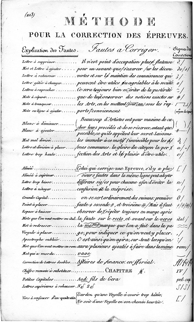
Correction marks plate.
One of the distinctive features of Vinçard and his manual, right from the first edition of 1806, is his proposal for a new type-case layout, which he called hamapolygrammatique. He had patented it as early as 1804.
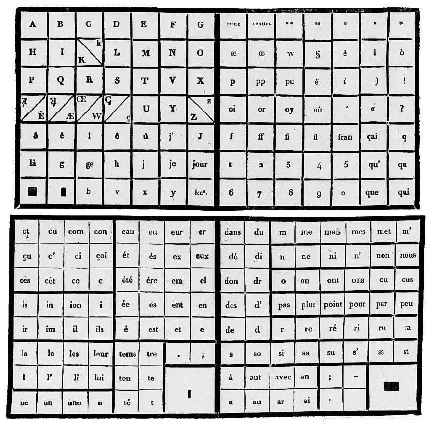
The 1804 patented type case.
Having had a second look at the complexity of his invention, he simplified it when his manual appeared in 1806, and made no further changes when the book was reissued in 1823.
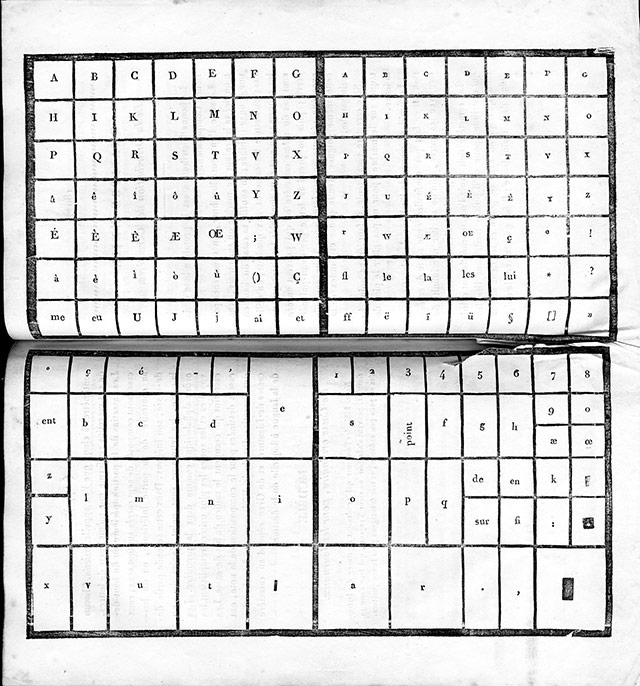
The 1823 type case.
The fact that this manual went through two editions during the nineteenth century—a period when technological developments were occurring at an almost daily pace—gives us an opportunity to observe how printing practices evolved. In 1806, ink balls were still the principal means of inking the formes, although the inking roller had made its appearance in the final years of the previous century. Vinçard's 1806 manual therefore illustrates the ink balls in much the same way as the Encyclopédie had done.
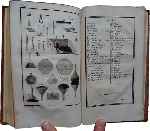
1806 plate: the ink balls. The two fingers holding the book open for the photograph belong, of course, to yours truly.
The 1823 edition has much the same illustration, more or less… but this time the inking roller makes an appearance, because by then its use had become widespread.
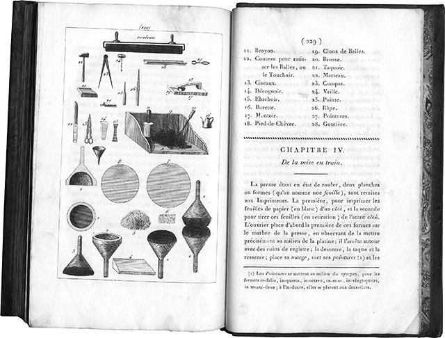
Ink balls and roller plate from the 1823 edition, with the captions on the right-hand page.
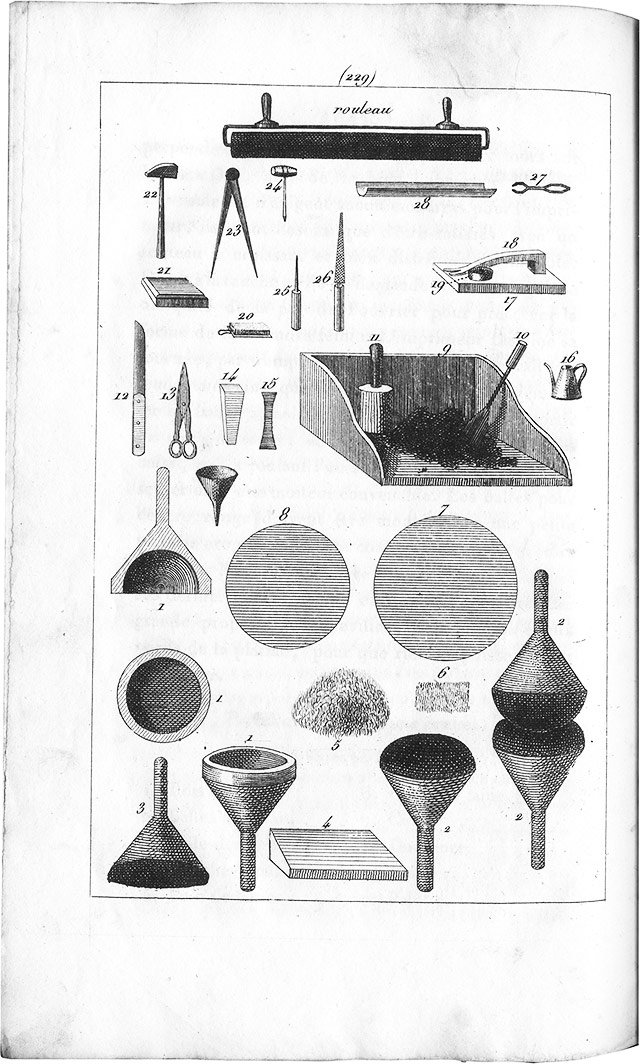
Ink balls and roller plate only.
And there we are. I have the feeling that, for once, I've been a little long-winded. I'll try to be more concise next time. Well… I hope so, anyway…
Undergrowth typography
- • Attentiveness
- • Questioning
- • Begining
Typographical practice
- • Typography manual
- • Mould
- • Letterpress for beginners
- • Blains printing museum
- • A post card
- • A post card
- • Marabouts from A to D
- • Treading
- • Visit to Bannes
- • Homework
- • Curving machine
- • Haas and Frutiger
- • K crossed out
- • Word stamp
- • Hatching
- • Gutenberg in comics [2]
- • Champagne Printing Museum
- • Stamp
- • Gutenberg in comics [1]
- • Subscribed signs
- • Typofeminism
- • Rebais house of Printing
- • Cedilla
- • Versatur
- • Ben-day
- • Letters
- • wood types
- • Tours typography museum
- • Old book
- • Types...
- • Abbreviation
- • Height to paper
- • Mystery font
- • Typographic old times
- • Cleaning up a Della Robbia case
- • Type case [2]
- • Type case [1]
- • Bijou typographique n° 2 Émile Teillac
- • Restoration of an typo case
- • To murder the typo?
- • Little brother
- • Wishes 2014
- • Mould & library
- • Wishes 2013
- • Chromotypography
- • Wishes 2012
- • Decoration
- • The tools of the workshop [9]
- • The tools of the workshop [8]
- • The tools of the workshop [7]
- • The tools of the workshop [6]
- • The tools of the workshop [5]
- • The tools of the workshop [4]
- • The tools of the workshop [3]
- • The tools of the workshop [2]
- • The tools of the workshop [1]
- • Attrape-science
- • Drawing of the letter
- • Handbook
- • Atelier de Saint-Maur
- • Au courant
- • Gutenberg
- • Format typographique
- • Summer journey
- • Apostrophe
- • Baguette
- • Saint-Jean
- • Childishnesses
- • Logo
- • New typography at Estienne school
Typo des rues
Tools
- • Table
- • Specimen
- • Roller
- • Bellows
- • Invention patent
- • Magnifying Glass
- • Autograph presses -2
- • Autograph presses -1
- • Copy press
- • cardboard shears
- • Shear
The picture of the day...
- • Fresco
- • Treasure
- • Black and white
- • Papaver
- • Little prince...
- • Vegetable garden
- • Gâteaux
- • Macrosillon
- • Mills
- • Ring
- • Noise
- • Hedgehog
- • Hell
- • Sheep
- • Writing
- • Procrastination
- • Buffalo
- • Free
- • Enameled sheet metal
- • Emergency
- • VGT
- • Advice
- • Crucifixion
- • Plane tree (bis)
- • Garbage can
- • Pencil
- • Berries
- • Foresightedness
- • Heritage (continued)
- • Heritage
- • Mona
- • Craftsmen
- • Carrot
- • Ladybug
- • Punning signs
- • Weather report
- • Velocipede
- • Mysterious shop
- • Plane tree
- • Cathedral
- • Dissent
- • Heart
- • No entry
- • A-Z
- • Glass harmonica
- • Silence
- • Decentralization
- • Things
- • Julie
- • Socks
- • Cats (continued)
- • Rebus
- • Tit
- • Cats
- • Linen
- • Love story
- • Bowltree
- • Man
- • Athée (atheist)
- • Supposition
- • Cocktail
- • Arago
- • Hopscotch
- • Watchdog
- • Road safety
- • Queue
- • Tradition
- • Freedom
- • Curl up into a ball
- • Revelation
- • Chocolate
- • Easter Bunnies
- • Exhortation
- • An attempt...
- • Duplicity
- • Ores
- • Models
- • Estienne school
- • Anonymous letters
- • Heads
- • Game
- • Box
- • Consultant
- • Reflexions
- • Rain
- • Stencil and graffiti
- • Green
- • Nocturnal
- • Silence
- • Bliss
- • Volumen
- • Lack
- • Ant
- • Tube
- • Torn paper
- • On the ground
- • On the country lane
- • Music
- • Shift
- • Pâté
- • Wash
- • Pose
- • Ban
- • Come back at Ognes
- • Butcher's shop
- • Tower
- • Underground french humor
- • Four colors
- • Sleeping Cinderiding hood
- • In color
- • Road
- • Shadow puppet show
- • Chair
- • December 31
- • December 31
- • D day
- • TBlue
- • Titanium or zinc?
- • Flakes
- • Potesses
- • Old story
- • Solution
- • Credit
- • Horses
- • History
- • Abandoning
- • Camping
- • Declaration
- • Home
- • Crise
- • Memento mori
- • Anges...
- • Dressage
- • Rien
- • Décoration
- • Retraite
- • Bas-relief
- • Autumn
- • Imitation
- • Expedition
- • Repiquage
- • Croquenots
- • Godasses
- • Vint le vain vin
- • Désertion ou expulsion
- • In the street...
- • At the bookseller...
- • Come back
- • Rencontre
- • Baby
- • Apple
- • Striptease
- • Book shop
- • Counters
- • Spring
- • Vertus
- • Pavés
- • Curiosities
- • Handcuffs
- • Sens
- • Festive
- • Questions
- • Flowers
- • Order
- • It does not run any more...
- • It runs...
- • Cat (2)
- • Apprentice
- • Gifts
- • Seal
- • Bourse
- • wine
- • 2009
- • Art
- • Cat
- • Bred
- • Streets
- • Games
- • Red and bearded in December (an another image)
- • Maritime prefect
- • Pleonasm?...
- • Wink
- • Renewal.
- • Shadow
- • Mis-spelling
- • Laughter
- • here
Tales ans short stories
- • Papillote joke
- • Passe-muraille
- • Cluttered sidewalks
- • Poem
- • Bursery rhyme
- • Life &nd comic strip
- • Poetry...
- • literary games
- • Do nopt...
- • Pavement
- • cardboard packaging
- • Mauricette
- • Edge
- • The killer bathtubs
- • The woodeaters
- • Incognito
- • Anonymous
- • Fish (end)
- • Fish
- • On the valley
- • In the street
- • Birth of stars
- • Fly
- • Tourism
- • Mars en mai
- • Hygienic
- • Return
- • Tale
Streets typography
- • Beautiful sentences 42]
- • Signage
- • Sign painter
- • Stone engraving
- • Vécé
- • Readability
- • Beautiful sentences 41]
- • Paint
- • Crochet typography
- • Wild poster
- • Composite
- • Beautiful sentences [40]
- • Composite signs
- • Street signs
- • Polyglot
- • Sculpted typography
- • Apostrophe
- • Stencil-sign
- • Beautiful sentences [39]
- • Spraying
- • Stencil
- • Scandinavian
- • Beautiful sentences [38]
- • Accent
- • Cheeseshop
- • Beautiful sentences [37]
- • Iron forged letters [11]
- • Beautiful sentences [36]
- • Braille
- • Beautiful sentences [35]
- • Beautiful sentences [34]
- • Shadow
- • Mosaic
- • Hairdersser
- • Palimpsest
- • Beautiful sentences [33]
- • Roof
- • Beautiful sentences [32]
- • Beautiful sentences [31]
- • Cow
- • Dog
- • Iron forged letters [10]
- • Beautiful sentences [30]
- • Beautiful sentences [29]
- • Iron forged letters [9]
- • Streets names
- • Beautiful sentences [28]
- • Beautiful sentences [27]
- • Painted storefront
- • Inverted types
- • Gutenberg
- • Beautiful sentences [26]
- • Funeral Typography
- • Beautiful sentences [25]
- • Painted sign
- • Accents
- • Typographic sign
- • Rich
- • Calligraphed sign
- • Pixelation
- • Beautiful sentences [24]
- • Beautiful sentences [23]
- • Iron forged letters [8]
- • Generations
- • In the window
- • Street sign
- • Grammar
- • For typographers
- • Multiple choice
- • Beautiful sentences [22]
- • Beautiful sentences [21]
- • Signs
- • Question of perspective
- • Colors of love
- • The art of correction
- • Beautiful sentences [20]
- • Signboard
- • Beautiful sentences [19]
- • A little bit of everything
- • Love typo
- • Glazed ceramic
- • Bright typography
- • Family
- • Beautiful sentences [18]
- • Bell
- • Typographic Avaricum
- • Iron forged letters [7]
- • Iron forged letters [6]
- • Execution of letters
- • Beautiful sentences [17]
- • Beautiful sentences [16]
- • Palimpsest
- • In
- • Rhesus
- • Vegetal typography [2]
- • To dot the i's
- • Beautiful sentences [15]
- • Military
- • Cedilla
- • Military
- • Military
- • Beautiful sentences [14]
- • Electricity
- • Front
- • Beautiful sentences [13]
- • Drop of milk
- • Painted sign
- • Iron forged letters [5]
- • Beautiful sentences [12]
- • Beautiful sentences [11]
- • Area
- • Sign
- • Beautiful sentences [10Prose de gouttière]
- • Beautiful sentences [9]
- • puny tribute
- • Beautiful sentences [8]
- • Iron forged letters [4]
- • Printing works [7]
- • Bar-barisme
- • Iron forged letters [3]
- • Shadow
- • Other iron forged letters
- • Beginning and end
- • Iron forged letters
- • Beautiful sentences [7]
- • Printing works [6]
- • Dates
- • Roman numerals
- • Chimney
- • Chocolate
- • Beautiful sentences [6]
- • Credit lyonnais
- • Diaeresis
- • Printing works [5]
- • Printing works [4]
- • Plate
- • Typo versus Batman
- • Mingling
- • Recycling
- • Hand made [2]
- • Hand made
- • Vegetal typography
- • Orientation
- • Waffle
- • Ad
- • Commonplaces
- • li
- • Stencils
- • Beautiful sentences [5]
- • Neighborhood
- • Kerning
- • Printing works [3]
- • Caractère
- • Beautiful sentences [4]
- • Printing works [2]
- • Printing works [1]
- • Beautiful sentences [3]
- • Signs
- • Wishes 2011
- • Ion
- • Stuttering
- • Beautiful sentences [2]
- • Beautiful sentences [1]
- • Mystical
- • Shop window
- • Interdit
- • Solutions bétonnées
- • Typo béton
- • Oz
- • Enigma
- • Terrible
- • Lecture
- • Épitaphe
- • De bric
- • Butcher's shop
- • Alphabet
- • Typo t(h)in
- • Weaving
- • Carmelites
- • Adéquation
- • Big dot
Spirit of the times
Rural typo
- • Botanical typography
- • Goal
- • Straw typo
- • J in the mist
- • A of the electric pole
- • Break
- • Champagne
- • B of the road sign
- • Wall C
- • P fields
- • Big
- • Roman numerals
Proverbs
- • Umbrellas
- • Proverbs: vine
- • Illustrated proverbs [2]
- • Illustrated proverbs
- • Circonstance
- • Astres
- • Proverbs : affabulation
- • Proverbes : rire
- • Proverbs: way
- • Proverbs: culture
- • Proverbs: let falling
- • Proverbs: new year's day
- • Proverbs: poppy
Printings
- • Procede 136
- • Printing?
- • Freinet press
- • Typo-Lauga press
- • Lino press
- • Linocut
- • Wall stencil
- • Stencil
- • Heliophore
Printing
- • Small toy presses from Fornax [9]
- • Small toy presses from Fornax [8]
- • Small toy presses from Fornax [5bis]
- • Small toy presses from Fornax [7]
- • Small toy presses from Fornax [6]
- • Small toy presses from Fornax [5]
- • Small toy presses from Fornax [4]
- • Small toy presses from Fornax [3]
- • Small toy presses from Fornax [2]
- • Small toy presses from Fornax [1]
- • Printing on egg
- • Game
- • Types
- • Visit
- • Magaud press
- • Processes
- • A forgotten (or almost) process
- • Tiny press
Post-competition
- • Two names of streets
- • Streets names [22]
- • Streets names [21]
- • Streets names [20]
- • Streets names, one more + 1
Places of conviviality
- • Forest conviviality [20]
- • Urban conviviality [20]
- • Urban conviviality [19]
- • Urban conviviality [18]
- • Urban conviviality [17]
- • Urban conviviality [16]
- • Church
- • Urban conviviality [15]
- • Urban conviviality [15]
- • Urban conviviality [14]
- • Urban conviviality [13]
- • Urban conviviality [12]
- • Rural conviviality [2]
- • Urban conviviality [11]
- • Urban conviviality [10]
- • Urban conviviality [9]
- • Urban conviviality [8]
- • Urban conviviality [7]
- • Urban conviviality [6]
- • Urban conviviality [5]
- • Urban conviviality [4]
- • Urban conviviality [3]
- • Boulevard Merklen
- • Urban conviviality [2]
- • Urban conviviality [1]
- • Rural conviviality [1]
My masters
Literature
- • Content
Internal news
- • Memories, 2
- • Memories
- • Stanhope press [2]
- • Stanhope press
- • Few words and a new greeting card
- • Arts and crafts
- • Cooking on the stove
- • Few words and a card
- • A workshop
- • 202... 4
- • Week-ends de reliure, week-ends de typographie
- • Two new books
- • 2023, why not?
- • JEMA
- • 2022 is coming
- • Speaker! ...
- • 2021... phew!
- • New, at last...
- • 2020... and you would like we are happy ?
- • Some lectures (in french) by CLS
- • 2019 begins with a little stupidity
- • Novlety springtime 2018
- • New year then new wishes
- • New wishes and new display
- • Easter 2013
- • Mist
- • The online bookshop
- • Fornax web site
- • Online bookstore
- • Monkey and riverhorse
- • Printing works [7]
- • Demonstration
- • Cro
- • 2 birds 1 stone
- • Talkative
- • Radio
- • Lassicope
- • Move
- • Page(s) 11
- • L'atelier
- • Exclusive interview
- • Novelties
- • Punctuation
- • Sens continu
- • Card
- • New article
Friends
Fourneau-Fornax
- • New
- • The Widow and me
External news
- • Cutlery
- • Congruence
- • Hanji
- • Death of a house
- • A friend
- • Commemoration
- • Poppies
- • Jérôme Peignot
- • Refuge and gregariousness
- • Hospital and school
- • Shutdown
- • Budgetary restrictions
- • Books and letterpress
- • Scoop
- • Comme ça
- • Con, peut-être
- • Fornax détective
- • Translation
- • Evening
- • Jean-Jacques Sergent's workshop
- • Down-to-earth
- • From Michel Lasserre
- • Mystic revelation
- • Streets names, one more
- • Come back
- • France
- • De nos auteurs : Jacques Abeille
- • De nos auteurs : Esther L
- • Coup de cœur
- • Fabrique des Icebergs
- • François Caradec
- • Riddle
- • Jacques André
- • Fattypo
- • Paper
- • Publication
- • A post
- • Pieces of wood
- • Price
- • Ink stains
- • Gambles
Editorial practice
- • Self-advertising
- • The last book... but not at Fornax
- • Two last books...
- • Detective novel
- • La feuille Toril
- • Espèce d'espèces
- • La Boétie
- • Nul
- • Fortuitous meeting
- • A mute who makes talk.
- • Good Taste
Competition
- • Streets names, one more
- • Street's names are back
- • Street's names
- • Revolutions
- • Streets names [4]
- • Streets names [3]
- • Streets names [2]
Bookish teratology
- • Among layout designers
- • Chez les éditeurs [4]
- • Chez les éditeurs [3]
- • At the readers [1]
- • Terreur au château
- • At the bookbinders [2]
- • At the bookbinders [1]
- • At the publishers [1]
- • At the industrial bookbinders [1]
Book
- • Book
Book-collecting
- • A book or book one...
- • Flip-book
- • Writers
- • Paul Fort
- • Rubber stamp
- • Voltaire
- • Coffin
- • Some books
- • Greeting
- • Bookmark
- • Library of the Estienne school
- • Humor (next and end)
- • Humor
- • Anisther publishing, twice
- • Anisther publishing
- • From a poet
- • Fayard [2]
- • Fayard
- • Lucky find
- • Juvenilia fournaldiennes
- • Grass
- • Serialized novel
- • Murderers in cellulose
- • Press office
- • Picture
- • Binding
- • Lot [4]
- • They have done
- • Workshop
- • L'Instituteur
- • Wishes 2010
- • Paresse
- • Literature in fields [2]
- • Lexicography
- • Literature in fields
- • Bulletin SJV
- • Bob and Bobette returns!
- • Lot [3]
- • Bob and Bobette
- • Penitent
- • Lot [2]
- • Lot [1]
Bibliophilie
- • A forgotten text by Thomas Narcejac
- • Brins de plume
- • The sex of books
- • Florentin Mouret and books
- • Smallest book
- • Popular
- • Marble
- • Wedge
- • Hollander beater
- • A memory
- • Keepsake
- • Manicle
- • Bookseller
- • Several wordsmiths [5]
- • Several wordsmiths [4]
- • Failed binding
- • Several wordsmiths [3]
- • Several wordsmiths [2]
- • X...
- • Hommage au grand homme
Art
- • In the countryside
- • Art & ad
- • Simone
- • Angel
- • Portrait
- • Mosaic
- • Pole
- • Linocut
- • Menhirs
- • Code
- • Street artists
- • Street art
- • Artificial intelligence
- • Tag and stencils
- • Tintin and Snowy (end)
- • Tintin and Snowy by Leonardo
- • Chromolithography
- • Installation
- • Calligraphy [2]
- • Ugly stickers
- • Eyes
- • Characters
- • The franc come back
- • Spray [2]
- • NNuit des musées [2]
- • Nuit des musées
- • Giraffe
- • Tree
- • Nom d'une pipe
- • Calligraphy
- • Bomb
- • A cat, one more time
- • Graffiti
- • Classic
Alphabet
- • Block
- • Embroidered alphabets
- • Initial
- • Archives nationales
- • Cross-stitch
- • With a needle
- • Metropolitan
- • V getal
- • Dr. Seuss
- • Rio
- • The Z
- • The Y
- • The X
- • The W
- • The V
- • The U
- • The T
- • The S
- • The R
- • The Q
- • The P
- • The O
- • The N
- • The M
- • The L
- • The K
- • The J
- • The I
- • The H
- • The G
- • The F
- • The E
- • The D
- • The C
- • The B
- • The A
Typography manual ...
Memories, 2 ...
Content ...
Table ...
Mould ...
Joli Tu sais, je suis de plus en plus en admiration de la Nature. ...
Merci Valère. Maintenant la lecture me paraît évidente. Je butais sur ce mot sa ...
" Arpenter les dédales verticaux " , semble-t-il ... ...
Merci pour la pub ! Nous sommes contents d'avoir ta contribution. Voici ...

|
October 2026 |  |
||||
| S | M | T | W | T | F | S |
| 01 | 02 | 03 | ||||
| 04 | 05 | 06 | 07 | 08 | 09 | 10 |
| 11 | 12 | 13 | 14 | 15 | 16 | 17 |
| 18 | 19 | 20 | 21 | 22 | 23 | 24 |
| 25 | 26 | 27 | 28 | 29 | 30 | 31 |
Fornax éditeur 18, route de Coizard, F51230 Bannes – France

