Page loading


Flyer

-

 Authors
 -
Chronological
- • 1977 (1-12)
- • 1978 (13-23)
- • 1979 (24-27)
- • 1980 (28-39)
- • 1981 (40-52)
- • 1982 (53-64)
- • 1983 (65-74)
- • 1984 (75-97)
- • 1985 (98-114)
- • 1986 (115-120)
- • 1987 (121-127)
- • 1988 (128-134)
- • 1989 (-)
- • 1990 (135)
- • 1991 (136-138)
- • 1992 (139-144)
- • 1993 (145-153)
- • 1994 (154-163)
- • 1995 (164-172)
- • 1996 (173-188)
- • 1997 (189-194)
- • 1998 (195-196)
- • 1999 (197-201)
- • 2000 (202-206)
- • 2001 (207-213)
- • 2002 (214-220)
- • 2003 (221-224)
- • 2004 (225-226)
- • 2005 (227-229)
- • 2006 (230-231)
- • 2007 (232-237)
- • 2008 (238)
- • 2009 (239-247)
- • 2010 (248)
- • 2011 (249-251)
- • 2012 (252-255)
- • 2013 (256)
- • 2014 (257)
- • 2015 (-)
- • 2016 (258-260)
- • 2017 (261-263)
- • 2018 (264-269)
- • 2019 (270-273)
- • 2019 (274-276)
- • 2021 (277)
- • 2022 (278-281)
- • 2023 (282-284)
- • 2024 (285-285b)
- • 2025 (286-288)
- • 2026 (289)
-
Des barbares...
-
Biblioteratology
- • 01. Chez les brocheurs [1]
- • 02. Chez les éditeurs[1]
- • 03. Chez les relieurs [1]
- • 04. Chez les relieurs [2]
- • 05. Chez les éditeurs [2]
- • 06. At the readers [1]
- • 07. Chez les éditeurs [3]
- • 08. Chez les éditeurs [4]
- • 09. Chez les éditeurs [5]
- • 10. Chez les relieurs [3]
- • 11. At the bookstores [1]
- • 12. Among layout designers [1]
-
Entertainments
-
Fin-de-Siècle
-
Fourneau and Fornax
-
Printings
-
Typography


est un éditeur artisan établi en Champagne (dans le petit village de Bannes)
qui a aussi eu pendant 26 ans un atelier en Île de France (dans le petit village de Paris),
mais ne l'a plus.


L'atelier de Bannes.

Those who know me vaguely, perhaps even those who think they know me rather better, or even know me well, not to mention the ordinary two-legged creatures who don't know me at all, are liable to think—when they think, that is, which not everyone does—that I am first and foremost a printer, and that, as a printer, I am nothing more than a foul-mouthed, backward-looking devotee of old-fashioned hot-metal typesetting. Or next to nothing else. If that's what you think of me, potential reader, assuming you actually exist, or young lady reader of my dreams, "ce que tu te goures, ce que tu te gourres" (Both spellings are possible in French, even though Queneau opted for the first.) Approximatively: boy (or girl), are you wrong! Wrong, wrong! Of course, there's a grain of truth in these misleading assumptions, but that's by no means the whole story.
I learned typography, because everything can be learned, even the trade of international criminal or head of state (which amounts to much the same thing). I learned it to make books, and only to make books, so that I could master every aspect of the process, from writing my own texts—or choosing someone else's—to the finished product, taking in the layout, any illustrations, the printing, and the folding of the printed sheets along the way. But before I learned that damned hot-metal typography, I had learned screen printing with some friends who, like me, had taken part in the events of May 1968. And it was by screen printing that I made my very first book.
The year was 1973. I was in my first year at Estienne, the Paris printing school, but I had already had my own screen-printing workshop for some time, a workshop I had built with my own fair hands, apart from the squeegees and the ink, which I bought from Tripette et Renaud. At Estienne in the 1970s, you simply did not talk about screen printing. Screen printing was taboo. Letterpress, offset, and rotogravure were our trinity of goddesses, to whom we were expected to give thanks at every hour of the day and night. Things have changed since then. Screen printing is now accepted there, and the religion of Estienne has become monotheistic. These days, they worship that cow, IO—or rather, 1 0—the goddess of all things digital.
So, 1973. Classes were over, summer was beginning, and with it came an overwhelming urge to make a proper book. I mentioned the idea to a friend (someone I rarely see these days), and we decided to work out the contents together. Twelve texts that might be called poems (or might not…), six by each of us. Each of us would illustrate three of our own texts and three of the other's. I would take care of the layout and the actual production, using screen printing, while my collaborator went off on holiday.
I was bursting with enthusiasm, filled with an indescribable happiness at the prospect of embarking on this adventure. It was my first real book layout, and I conceived it so that the book would be impossible to leaf through. When you hold it in your hands and try to turn the pages, all you see is blank paper. I was rather pleased with myself, I can tell you. I then hand-lettered the texts with a brush on the transparent film used to expose the screens, and turned our drawings into films for printing as well. July and a good part of August went by in the making of the book, right through to the final assembly. Sixty copies, in A4 format, five of them not for sale.
It was while making this book that I discovered the wonderful possibilities of manual screen printing. Of all printing techniques, it is the only one within the reach of ordinary mortals like us that allows white (or any other light colour) to cover black (or any other colour) without becoming dirty, remaining truly white or retaining its original hue. A quasi-mystical technique that makes immaculate conception possible, even for donkeys and great big oxen. A genuine miracle for those of sound mind!
To tell you that I am still proud of this book today would be an exaggeration. I still appreciate the practical achievement, certainly… but as for the contents… The title of the book is an exquisite corpse that my friend and I came up with together, the first and best of a little series. The cover drawing was done by Nicolas Stavropoulos, who was in charge of the visual arts workshop in Villejuif, where we attended classes in drawing—still life, the nude, clothed poses—and in lino and woodcut printing. We printed our engravings, of all things, on a lithographic press!
There is no need to be ashamed of one's early work. This book is the first tangible witness to an evolution that was my own. The same is true of anyone who ventures into creative work, unless he or she is irredeemably hopeless. So, here it is. I'm not passing judgment on it. I'm simply showing it to you.
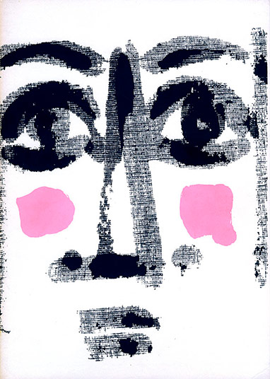
As those curious enough to leaf through the PDF I made from a copy in my personal collection will have noticed, this book contains a great many blank pages. The explanation lies in the structure of the layout. Each text is illustrated by an image, and the text and image are printed on one side only of a separate sheet. They face one another, tucked inside a four-page folder, whose first page bears the title of the text. The first six texts are by Michel Tabanou, who illustrated the first three; I illustrated the last three. The next six texts are mine: Tabanou illustrated the first three, and I illustrated the last three.
You are perfectly entitled to like it or dislike it. Make the most of that freedom, in every possible way, while you can. Before long, freedom of opinion may no longer be quite what it is today…
Those who know me vaguely, perhaps even those who think they know me rather better, or even know me well, not to mention the ordinary two-legged creatures who don't know me at all, are liable to think—when they think, that is, which not everyone does—that I am first and foremost a printer, and that, as a printer, I am nothing more than a foul-mouthed, backward-looking devotee of old-fashioned hot-metal typesetting. Or next to nothing else. If that's what you think of me, potential reader, assuming you actually exist, or young lady reader of my dreams, "ce que tu te goures, ce que tu te gourres" (Both spellings are possible in French, even though Queneau opted for the first.) Approximatively: boy (or girl), are you wrong! Wrong, wrong! Of course, there's a grain of truth in these misleading assumptions, but that's by no means the whole story.
I learned typography, because everything can be learned, even the trade of international criminal or head of state (which amounts to much the same thing). I learned it to make books, and only to make books, so that I could master every aspect of the process, from writing my own texts—or choosing someone else's—to the finished product, taking in the layout, any illustrations, the printing, and the folding of the printed sheets along the way. But before I learned that damned hot-metal typography, I had learned screen printing with some friends who, like me, had taken part in the events of May 1968. And it was by screen printing that I made my very first book.
The year was 1973. I was in my first year at Estienne, the Paris printing school, but I had already had my own screen-printing workshop for some time, a workshop I had built with my own fair hands, apart from the squeegees and the ink, which I bought from Tripette et Renaud. At Estienne in the 1970s, you simply did not talk about screen printing. Screen printing was taboo. Letterpress, offset, and rotogravure were our trinity of goddesses, to whom we were expected to give thanks at every hour of the day and night. Things have changed since then. Screen printing is now accepted there, and the religion of Estienne has become monotheistic. These days, they worship that cow, IO—or rather, 1 0—the goddess of all things digital.
So, 1973. Classes were over, summer was beginning, and with it came an overwhelming urge to make a proper book. I mentioned the idea to a friend (someone I rarely see these days), and we decided to work out the contents together. Twelve texts that might be called poems (or might not…), six by each of us. Each of us would illustrate three of our own texts and three of the other's. I would take care of the layout and the actual production, using screen printing, while my collaborator went off on holiday.
I was bursting with enthusiasm, filled with an indescribable happiness at the prospect of embarking on this adventure. It was my first real book layout, and I conceived it so that the book would be impossible to leaf through. When you hold it in your hands and try to turn the pages, all you see is blank paper. I was rather pleased with myself, I can tell you. I then hand-lettered the texts with a brush on the transparent film used to expose the screens, and turned our drawings into films for printing as well. July and a good part of August went by in the making of the book, right through to the final assembly. Sixty copies, in A4 format, five of them not for sale.
It was while making this book that I discovered the wonderful possibilities of manual screen printing. Of all printing techniques, it is the only one within the reach of ordinary mortals like us that allows white (or any other light colour) to cover black (or any other colour) without becoming dirty, remaining truly white or retaining its original hue. A quasi-mystical technique that makes immaculate conception possible, even for donkeys and great big oxen. A genuine miracle for those of sound mind!
To tell you that I am still proud of this book today would be an exaggeration. I still appreciate the practical achievement, certainly… but as for the contents… The title of the book is an exquisite corpse that my friend and I came up with together, the first and best of a little series. The cover drawing was done by Nicolas Stavropoulos, who was in charge of the visual arts workshop in Villejuif, where we attended classes in drawing—still life, the nude, clothed poses—and in lino and woodcut printing. We printed our engravings, of all things, on a lithographic press!
There is no need to be ashamed of one's early work. This book is the first tangible witness to an evolution that was my own. The same is true of anyone who ventures into creative work, unless he or she is irredeemably hopeless. So, here it is. I'm not passing judgment on it. I'm simply showing it to you.
As those curious enough to leaf through the PDF I made from a copy in my personal collection will have noticed, this book contains a great many blank pages. The explanation lies in the structure of the layout. Each text is illustrated by an image, and the text and image are printed on one side only of a separate sheet. They face one another, tucked inside a four-page folder, whose first page bears the title of the text. The first six texts are by Michel Tabanou, who illustrated the first three; I illustrated the last three. The next six texts are mine: Tabanou illustrated the first three, and I illustrated the last three.
You are perfectly entitled to like it or dislike it. Make the most of that freedom, in every possible way, while you can. Before long, freedom of opinion may no longer be quite what it is today…
To my friend Jean-Paul Goujon
“You didn’t post your usual piece last Monday…”
“Nope…”
“Couldn’t be bothered?”
“Nope. I was ill…”
“Oh! And that stopped you writing your post?”
“Well, yes… I wasn’t much in the mood. I decided the best way to nurse myself back to health was to do absolutely nothing.”
“And did it work?”
“Well, yes, a little. It does you good to do nothing every now and then. Gives you a rest. And rest can be a bit of a cure in itself, sometimes.”
“Yes, but not always…”
“No, not always… but in this case, yes. A little…”
“And are you going to write your post after all?”
“Well, yes. I’m writing it right now…”
“Oh, I see… In that case, I’ll leave you to it.”
“Thank you…”
I’m not one to complain, but some people are really quite… Anyway, let’s move on.
Now, let’s see… Ah, yes! A little while ago, certain people—ill-mannered souls, no doubt—responded to my work with a rather eloquent curl of the lip and remarks along the lines of: “Er, don’t take this the wrong way, but all that stuff you write about printing and technology… well, how shall I put it? We couldn’t give a damn!” Always a pleasure to hear, isn’t it? So, just to be absolutely clear, I’m not changing the subject to please them. Not at all. I’m changing it because, as someone once said, I simply can’t be bothered to carry on with the usual stuff. I’m not feeling particularly sprightly or full of beans just yet.
I’ve therefore decided to indulge the devotees of fin-de-siècle literature—that is, literature from the end of the nineteenth century—and its early twentieth-century successors. Some fifty years ago, there weren’t all that many of us who knew about this literature, let alone appreciated it. Nowadays, you can hardly get a foot in the door for the crowds. Times change. It’s like the weather: things are warming up.
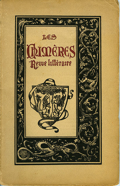
So here’s what I propose. I’ve taken an issue of a literary magazine from a shelf in my library—one within easy reach, which isn’t true of all of them. I picked it more or less at random. Did chance do me a good turn? I think it did, but you can be the judge.
Les Chimères
A poetry magazine, published on the fifteenth of every month
Paris, 76 rue du Rocher
Volume II, No. 11 — 15 February 1909 — 28 pages
Editor-in-chief: Adrien Bertrand
Editorial committee: Guy Robert du Costal, Alfred Machard, Claude-Léon Mercerot, Vincent Muselli, Henri Grach
Secretary-general: Henry Bertrand
Administrator: René Emanuelli
Contents
Émile Boissier, “Annick” — A poem dedicated to Frédéric Mistral, consisting of eleven quatrains in ten-syllable lines.
Guy Robert de Costal, “Sonnets” — Two monosyllabic sonnets, the first of which I simply cannot resist quoting, in french, of course:
La More
Dort
Son
Corps
Blond
Sur
Le
Lit
Dur.
Frêle
Sœur
Qui
Gît !
Pâle
Fleur…
Roger Vincent, “Souvenir” — “Chanson” — “Idylle anglaise” — Three poems: a sonnet; a poem comprising six quatrains of three seven-syllable lines and one two-syllable line; and a poem of ten quatrains in eight-syllable lines.
Adrien Bertrand, “La Douleur” — A poem dedicated to Théo Mittelsten Scheid, consisting of six six-line stanzas in alexandrines.
Alfred Machard, “Une escapade” — A short story featuring the child characters the author was so fond of.
E. Aubel, “Sonnet” — A sonnet in alexandrines, dedicated to Louis Perris.
Gaston Guilleré, “Mimodrame” — A sort of prose poem featuring the character of Pierrot.
Vincent Muselli, “Poème” — A poem consisting of three quatrains in alexandrines, dedicated to Édouard Marye.
André Petit, “L’Éveil de l’été” — A sonnet in alexandrines.
Edmée Delebecque, “Supplique” — “Dédicace” — Two poems in alexandrines: the first consists of seven quatrains, the second of sixteen lines.
Xavier Thylda, “Celles qui passent…” — “Dormeuse” — “Stances” — Three poems in alexandrines: two sonnets and a poem of two quatrains dedicated to Guy Robert du Costal.
André Petit, “Nuit” — A sonnet in alexandrines.
“Une Matinée” — An anonymous review of a literary matinée held at the Lemoine Hall, 17 rue Pigalle.
Finally, a statement by Adrien Bertrand announcing his resignation as editor-in-chief of the magazine so that he could take up the mantle of secretary to the committee charged with erecting a monument in honour of Catulle Mendès, who had recently ceased to be immortal.
***
“Tell me, sorry to butt in again… These chaps in your magazine aren’t exactly household names, are they?”
“No, they aren’t.”
“And if they seem rather partial to women, they don’t appear to pay them much attention. Not a single woman in the contents… So why are you bothering to write about them?”
“Oh, just to make them a little better known…”
“Right… Fair enough. But do you really think your pathetic little blog post is going to make your second-rate poets famous?”
“No, probably not… But perhaps some newly converted fin-de-siècle enthusiast might be tempted to dig a little deeper and take an interest in one or another of them. You never know…”
“Hmm… Possibly. But now that I think about it, your obscure dreamers seem a pretty reactionary bunch, what with their sonnets on every street corner. Not exactly modernists, are they? They don’t seem to invent much, with all that ice-cold classicism of theirs. They churn out alexandrines by the yard…”
“Fair point… But they do help us build up a little picture of the period. The Symbolists are more or less behind us, and Dada won’t be long in coming. In the meantime, there they are, these fellows… still here, just before the Great War comes along and kills them.”
“Hmm…”
To my friend Jean-Paul Goujon
“You didn’t post your usual piece last Monday…”
“Nope…”
“Couldn’t be bothered?”
“Nope. I was ill…”
“Oh! And that stopped you writing your post?”
“Well, yes… I wasn’t much in the mood. I decided the best way to nurse myself back to health was to do absolutely nothing.”
“And did it work?”
“Well, yes, a little. It does you good to do nothing every now and then. Gives you a rest. And rest can be a bit of a cure in itself, sometimes.”
“Yes, but not always…”
“No, not always… but in this case, yes. A little…”
“And are you going to write your post after all?”
“Well, yes. I’m writing it right now…”
“Oh, I see… In that case, I’ll leave you to it.”
“Thank you…”
I’m not one to complain, but some people are really quite… Anyway, let’s move on.
Now, let’s see… Ah, yes! A little while ago, certain people—ill-mannered souls, no doubt—responded to my work with a rather eloquent curl of the lip and remarks along the lines of: “Er, don’t take this the wrong way, but all that stuff you write about printing and technology… well, how shall I put it? We couldn’t give a damn!” Always a pleasure to hear, isn’t it? So, just to be absolutely clear, I’m not changing the subject to please them. Not at all. I’m changing it because, as someone once said, I simply can’t be bothered to carry on with the usual stuff. I’m not feeling particularly sprightly or full of beans just yet.
I’ve therefore decided to indulge the devotees of fin-de-siècle literature—that is, literature from the end of the nineteenth century—and its early twentieth-century successors. Some fifty years ago, there weren’t all that many of us who knew about this literature, let alone appreciated it. Nowadays, you can hardly get a foot in the door for the crowds. Times change. It’s like the weather: things are warming up.
So here’s what I propose. I’ve taken an issue of a literary magazine from a shelf in my library—one within easy reach, which isn’t true of all of them. I picked it more or less at random. Did chance do me a good turn? I think it did, but you can be the judge.
Les Chimères
A poetry magazine, published on the fifteenth of every month
Paris, 76 rue du Rocher
Volume II, No. 11 — 15 February 1909 — 28 pages
Editor-in-chief: Adrien Bertrand
Editorial committee: Guy Robert du Costal, Alfred Machard, Claude-Léon Mercerot, Vincent Muselli, Henri Grach
Secretary-general: Henry Bertrand
Administrator: René Emanuelli
Contents
Émile Boissier, “Annick” — A poem dedicated to Frédéric Mistral, consisting of eleven quatrains in ten-syllable lines.
Guy Robert de Costal, “Sonnets” — Two monosyllabic sonnets, the first of which I simply cannot resist quoting, in french, of course:
La More
Dort
Son
Corps
Blond
Sur
Le
Lit
Dur.
Frêle
Sœur
Qui
Gît !
Pâle
Fleur…
Roger Vincent, “Souvenir” — “Chanson” — “Idylle anglaise” — Three poems: a sonnet; a poem comprising six quatrains of three seven-syllable lines and one two-syllable line; and a poem of ten quatrains in eight-syllable lines.
Adrien Bertrand, “La Douleur” — A poem dedicated to Théo Mittelsten Scheid, consisting of six six-line stanzas in alexandrines.
Alfred Machard, “Une escapade” — A short story featuring the child characters the author was so fond of.
E. Aubel, “Sonnet” — A sonnet in alexandrines, dedicated to Louis Perris.
Gaston Guilleré, “Mimodrame” — A sort of prose poem featuring the character of Pierrot.
Vincent Muselli, “Poème” — A poem consisting of three quatrains in alexandrines, dedicated to Édouard Marye.
André Petit, “L’Éveil de l’été” — A sonnet in alexandrines.
Edmée Delebecque, “Supplique” — “Dédicace” — Two poems in alexandrines: the first consists of seven quatrains, the second of sixteen lines.
Xavier Thylda, “Celles qui passent…” — “Dormeuse” — “Stances” — Three poems in alexandrines: two sonnets and a poem of two quatrains dedicated to Guy Robert du Costal.
André Petit, “Nuit” — A sonnet in alexandrines.
“Une Matinée” — An anonymous review of a literary matinée held at the Lemoine Hall, 17 rue Pigalle.
Finally, a statement by Adrien Bertrand announcing his resignation as editor-in-chief of the magazine so that he could take up the mantle of secretary to the committee charged with erecting a monument in honour of Catulle Mendès, who had recently ceased to be immortal.
***
“Tell me, sorry to butt in again… These chaps in your magazine aren’t exactly household names, are they?”
“No, they aren’t.”
“And if they seem rather partial to women, they don’t appear to pay them much attention. Not a single woman in the contents… So why are you bothering to write about them?”
“Oh, just to make them a little better known…”
“Right… Fair enough. But do you really think your pathetic little blog post is going to make your second-rate poets famous?”
“No, probably not… But perhaps some newly converted fin-de-siècle enthusiast might be tempted to dig a little deeper and take an interest in one or another of them. You never know…”
“Hmm… Possibly. But now that I think about it, your obscure dreamers seem a pretty reactionary bunch, what with their sonnets on every street corner. Not exactly modernists, are they? They don’t seem to invent much, with all that ice-cold classicism of theirs. They churn out alexandrines by the yard…”
“Fair point… But they do help us build up a little picture of the period. The Symbolists are more or less behind us, and Dada won’t be long in coming. In the meantime, there they are, these fellows… still here, just before the Great War comes along and kills them.”
“Hmm…”

L’homme au coin

10 pages,
format 8,5 x 8,5 cm.
tirage à environ 30 exemplaires en typographie au plomb.
Thomas Braun
des fromages

8 pages,
format 11,2 x 9 cm.
tirage à 131 exemplaires en typographie.
CLS

Un volumen,
79 cm de long, 17,5 cm de haut.
tirage à 10 exemplaires en linogravure.
Marie-Rose de France

26 petits textes en proses poétique. Vignettes de CLS.
tirage à 120 exemplaires en typographie au plomb.
Marie-Rose de France
|
|
36 p., format 10 x 14 cm. composé et imprimé en typographie au plomb Tirage à 120 exemplaires. (cliquer sur l'image pour en savoir plus) |
... for those who are too lazy to seek.
14615122 visitors
99 visitors online
Fornax éditeur 18, route de Coizard, F51230 Bannes – France

